
Step 1
To start with, create a new 1000 x 1000px document. I personally prefer using RGB color mode due to the accessibility to a wide variety of vibrant color ranges.
Step 2
Let's' start with the dial. The most annoying step in designing a clock dial is the tick marks of different length and thickness around the face. So, to make your work easy, start this job before doing anything else.Draw a vertical line imagining it to be a connector between the 12th and 6th hour. Adjust the height of the line from the Control Palette to around 665 pixels. If your control palette is not already on, turn it on from Windows > Control Palette.
We need to do some small calculations here. We all know that there are 12 hour marks on a clock dial distributed within 360°, all at an equal angular distance. So, if you divide 360° by 12, you would get 30°. Therefore, the angular division between each two hour marks is 30°. So, make a copy of the straight line at a 30° angular distance using the Rotate Tool (R).

Step 3
We won't complete the other hour marks at this stage. Rather, we will proceed to the next step to further divide the 30° section into five more equal divisions. So 30° ÷ 5 = 6°. Make yet another 5 equal divisions of each 6° section, count 6° ÷ 5 = 1.2° for every smallest section. So, let's create 24 copies of the vertical straight line at a 1.2° angular distance.Here is a quick procedure to do it faster. First of all take one copy at 1.2° distance and then use the keyboard shortcut Control + D to create multiple copies at the same distance. Stop before you reach the 25th copy, because this would overlap the line we already created at 30°.

Step 4
So far we haven't altered the stroke weight of the lines. But commonly with a watch design, the major hour marks have a different color, shape or style. Different brands use different styles to distinguish them from the rest. Here we will follow the trend of making the hour marks, (i.e., 1, 2, 3,..., 12 etc.) slightly thicker than the rest.Select the first and the last line and apply a thicker stroke weight (5) to make them appear thicker. Now Shift + Select every fifth tick mark and use a thin stroke weight (3).

Step 5
Now it is time to finish the tick marks. Select all the lines, leaving the first one, (i.e, the one that runs between 12 and 6). Make a group (Control + G) and select the Rotate Tool (R). Make a copy of it at a 30° angular distance. Once done, keep making multiple copies (Control + D) until you have a complete 360° shape.

Step 6
The last stroke at the end will overlap the first one. Delete this line to reveal the first stroke. Some watches have the four quarter tick marks (12, 3, 6, 9,) a bit thicker than others. So, let's use that style. Select all and ungroup them (Shift + Control + G). Now select the two perpendicular lines and increase the stroke weight from 5 to 7.
Step 7
Once the ticks are complete, finishing the dial is not a laborious task.If you take a closer look, the thicker marks have a longer length in many watches, while the thinner ones are shorter. To do this, first we will select the Magic Wand Tool (Y) and double click on it to open the tool options. Click on the small arrow on right side of the Magic Wand Tool options palette. Turn on "Show stroke options". Click on the "Stroke Weight" checkbox that appears at the bottom of the palette. Drag the Tolerance slider down to 0. This will help us to select all the lines with same stroke weight in one click.
Currently we have lines with four different stroke weight values, 7, 5, 3, and 1. With the Magic Wand Selection Tool (Y), click on
any of the strokes with stroke weight 5. All strokes with same weight are selected. Now group them together. Follow the same procedure
to make three more groups for each stroke weight. For convenience I'll refer to each stroke style as group 7, group 5, group 3 and
group 1.
Select all groups and go to Object > Path > Outline Stroke. This will convert all the strokes into filled paths leaving the
groups intact.

Step 8
Create a 650 x 650px circle. Turn off the stroke if it is on and use any fill color. I have used white. Place it on top of the tick mark groups. Make two more copies of this circle and paste them on top. Change the height and width value from the control palette so that one of them will be 640 pixels and another 630 pixel in height and width.You should now have three circles with 650px, 640px and 630px in height and width value, I will refer these three circles as big, medium and small circle respectively. Press Control + A to select everything, go to the control palette and use the Horizontal and Vertical Align Center Tool.

Step 9
Select the small circle and Shift + Select Group 7. Go to Windows > Pathfinder to open the pathfinder options palette. Then Click on "Subtract from Shape Area" under "Shape Modes". Once this is done, click on the "Expand" button.Now we have four tick marks for 12th, 6th 3rd and 9th hour ready. Next, apply this same procedure to extract the other tick marks. To do this, first select group 5 and then group 3 together and make another group. Select this group and Shift + Select the bigger circle. Apply pathfinder just like we did above. Apply the same procedure on the remaining group,( i.e, group 1 and the big circle). You should now have all the tick marks ready for your watch dial.


Step 10
Now we are going to work on the clock face. To begin with, take a circle slightly bigger than the peripheral area covering all the tick marks. Send it behind by pressing Shift + Control + Left Square Bracket. Select all and align vertically and horizontally from the control palette. With the circle selection on, set the fill color to none and stroke weight to 15. Leave the stroke color to anything of your choice.You can apply any color to any component for the moment as we are not working on colors right now. Keep the circle selected and go to Object > Path > Outline Stroke. You have now created a ring around the dial.
Create another circle and send it behind all once again. Align it like before and scale it up so that it looks a little bigger than the ring. This defines the boundary of the watch dial.

Step 11
Time to apply colors. Before we go into any details, let's define the base color of the dial. Select the outermost circle, created in the previous step. Apply a stroke and set its color to a lighter value like R=228, G=188, B=150. Set the stroke weight to 1. Use a simple linear gradient fill, like what you see in the following image.
Step 12
Make an aligned copy of the same circle on top of itself by pressing Control + C and Control + F. Scale it down so that it touches the outer boundary of the tick marks. Keep the same stroke and gradient fill color. Lighten the color value of the left gradient slider.
Step 13
Let's work on the black ring now. In order to apply some thickness, select the ring and go to Object > Path > Offset path, enter -3 in the offset value field. Here we have another inner ring. By default, the outer and the inner rings are grouped together. You need to ungroup them before working on them individually.Apply gradient fill colors on both rings that resemble shiny gold metal. Here are my gold gradient settings. Try to create your own gradients using similar colors. Use the same stroke color from Step 11 on the outer ring. Remember to turn off the stroke on the inner ring.

Step 14
The outer ring looks nice but we need to make it more prominent. Select the outer ring and apply a Drop Shadow filter on it with the following settings.
Step 15
Play with the metal gradient settings further to enhance the 3D look of the ring. At this stage the dial should look similar to the example below.
Step 16
In this step you're going to create the center of the dial. Create four circles on top of each other with the bigger ones behind and the smaller ones on top. Select all and apply a horizontal and vertical alignment from the control palette. Apply suitable gradients like I have with mine. Finally they should have a nice metallic shape.You need these discs later while arranging the hands. From now on, I will call them disc1, disc2, disc3 and disc4. Select the four discs and hide them (Control + 3) for now, since we need a clean workspace.

Step 17
Let's add some nice shiny golden hands to this dial. But before we proceed, all the existing components need to be locked for precaution. Press Control + A to select all and lock everything by pressing Control + 2.Start with two basic rectangles which should be slightly tapered near the edges. The length of one of the rectangles should be longer than the radius of the dial, while the other one should be shorter. To taper the rectangles use the Direct Selection Tool (A) to select the anchor points of the rectangles individually and move them until they look like the following image.
The longer rectangle is going to be the minute hand and the shorter is the hour hand of the watch. The hand for seconds will be created later. The color of the rectangles are not important at this stage since we are going to work on it at the next step.

Step 18
Apply a golden gradient color to the minute hand and a dark gold on the hour hand. Turn off the stroke if it is on. Check the settings shown in the image below, note the gradient sliders. The colors and the sliders are adjusted in such a way that the hands appear to have a sharp and clear horizontal indentation.
Step 19
Let's add some style to the hands. Select the Rounded Rectangle Tool and set the corner radius to 5px. Create a very thin rounded rectangle on top of the minute hand. The length should cover more than 50% of the hour hand. Use the image below as a guide. Subtract the rounded rectangle from the minute hand using Pathfinder. Don't forget to expand it after finishing the subtraction.
Step 20
The short and the long hands in almost all watches have a different appearance. Therefore apply a different style to the hour hand. Make a copy of the hour hand right behind it by pressing Control + C and Control + B. Now create a normal rectangle and place it on top of the hour hand just the way you see below.
Step 21
Now select the top hour hand and the rectangle. Go to Pathfinder and choose "Intersect Shape Areas". Fill this new portion with black.Create another rounded rectangle and place it on top of the hour hand in the same way. Don't subtract it, rather keep it selected and pick the gradient color from the minute hand with the help of the Eyedropper Tool (I).

Step 22
We are almost done with the hands. Select both hands (leaving the components shown in the image) and take two offset copies for each hand by choosing Object > Path > Offset. Type 1px in the offset value field. Flip the gradient angle in both offset copies. This will add some thickness to the hands.Select the offset copies and apply a Drop Shadow effect (Effects > Stylize > Drop Shadow). You will re-adjust the settings later; therefore leave the settings as they are for now. This is why we have used the Drop Shadow effect instead of Drop Shadow filter so that we can work on it later. Make individual groups for both hands, (the hour and the minute hand).


Step 23
Un-hide (Control + Alt + 3) the four discs and rotate and arrange the hour and minute hand groups in a way so that it reads 10:11. Readjust the drop shadow settings so that it looks like the light is coming from top.
Step 24
Adjust the arrangement of the hands with respect to the discs. Select and cut (Control + X) the hour hand. Select disc 4 and paste the hour hand behind it by pressing Control + B. Follow the same procedure to cut and paste the minute hand behind disc 2.
Step 25
Creating the second hand is simple. Create a very thin rectangle, the length should be longest among all three hands. Pick a gradient from the minute hand with the Eyedropper Tool (I).
Step 26
Now, create five circles at the center on top of each other with the bigger ones behind and the smaller ones on top, like you did in step 16. Here is a quick tip to make it faster: Hide all the existing hands. Turn on smart guides by pressing Control + U. Select the Ellipse Tool (L) and bring your pointer close to the center of the discs. It will snap right at the center of the existing discs. Then press Shift + Alt to start creating the circles. After you are done, press Control + U once again to turn off smart guides.Pick gradient fill colors or strokes from existing components or create fresh ones. There is nothing mandatory in this step. You can try plenty of styles by varying the number and size of the discs and altering the gradients on them. Apply black to the smallest disc at the center.

Step 27
Now un-hide the hands and cut the second hand and paste it properly at the center behind top three discs, pointing in any direction you like. Use a similar drop shadow effect just like the on the minute and the hour hands.
Step 28
A watch with no space for month, day and date? - This is a small job. Select the Rounded Rectangle Tool and set the corner radius value to 8px. Now draw two squares. One should be around 72 x 72px and the other 50 x 50px.Subtract the smaller square from the larger one with the help of the Pathfinder and expand it. With the Eyedropper Tool (I), pick the gradient shade from disc1. Keep it selected and make a -2px offset copy on top of it and pick the gradient shade from disc2. Now we have two round frames, one on top the other. Apply stroke weight 1 on the outer square. Choose the same color value mentioned in Step 11(R=228, G=188, B=150).

Step 29
Create another rounded square of approximately 62 x 62px size. Apply a radial gradient which should range from light gray in the center to medium gray near the outside. Adjust the sliders to make it appear like the image below.
Step 30
Now cut and paste the gray square behind the two round frames. Choose a nice font and type "5 Dec" on the gray square. You are free to choose your own style of writing the day and month. Here I have created a small rectangle behind the month name. The day counter could also be created following the same method. Expand the text from Type > Create Outlines, if you want to apply some gradient shade on these texts. I left them black.Group them together and place them on a pair of rectangles so that they appear to be sitting on some indented base.

Step 31
Select them all and drag them over to the dial to place them at some suitable location. Resize them to match with other surrounding dial components.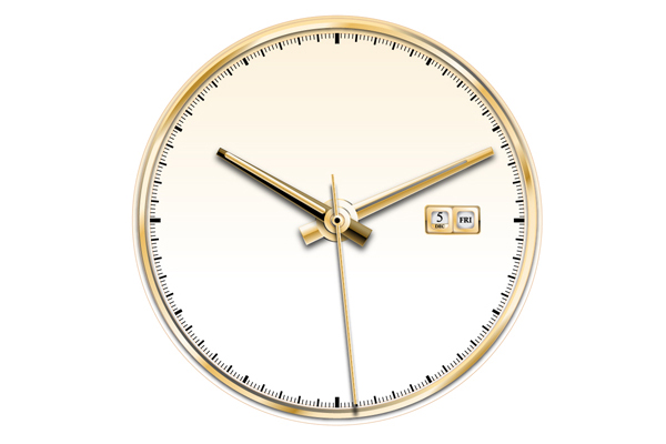
Step 32
Some elegant watches contain different texture and finish on the major hour marks. We are going to incorporate the same style on our watch. We have locked some of the dial components in step 17 . Unlock them now and select the 12th, 3rd, 6th and 9th hour mark with the help of Group Selection Tool. Pick gradient from disc 4. Take 2px offset copy and pick gradient from the hour hand. Push each of these hour marks (excluding the offset copies) slightly towards the periphery of the dials. Apply Drop Shadow Filter with the settings shown in the image below so that they look like thick gold metal.

Step 33
Time for a little bit of decoration. Remember the steps we used to create the day, date and month counters? Use the same methods to create exactly the same round frames or take a copy out of the previous ones. Place it below the 12th hour mark. We are going to createa large diamond piece inside this frame.
Start with a hexagon and a star with five hands. Inner radius of the star should be less than 50% of the outer radius. Select them together, go to Pathfinder and click on "Add to Shape Area". Expand the shapes. This is our basic diamond shape. Draw some arbitrary
lines on top of it. Each line should completely cut across the diamond shape.

Step 34
Group all lines together. Now select the hexagon and the grouped lines. Go to Pathfinder and choose Divide. This operation will break the hexagon into a number of chunks. Select the chunks individually and apply different shades of white and light gray fill andstroke colors. In any case the stroke weight should not be larger than 1. Experiment with the shades of white and gray till you are satisfied with the look of the diamond. Then place it on the frame we have just created below the 12th hour mark. Resize it to match with the frame.

Step 35
What about some nice brand name? GOLDEX. That's the name of my brand. You can choose a different name or use this one. Turn on Smart Guides and create a circle from the center of the dial. The circle should fit well inside the dial.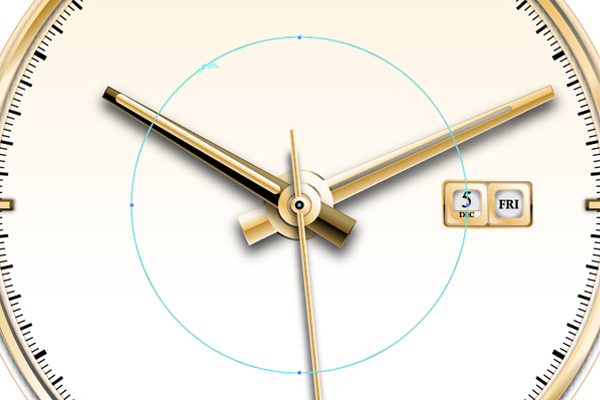
Step 36
Now select a decent font and type your brand name on this path using Type on a Path Tool. Adjust the text in such a way that the brand name fits just below the diamond.Go to Type > Create Outlines and pick some nice golden gradient from any of the shapes. You can adjust the angle and spread of the gradient if you like. Take a 2px offset copy and fill it with some darker golden gradient. Once again apply drop shadow filter on
this offset copy, with the following settings.

Step 37
Add some familiar text found usually on eminent watches. You might need to move the text behind the hands. Also adjust the gradient settings of the outermost circle of the dial so that the bottom portion appears darker and behind the shadow created by the ring on top ofit.

Step 38
Since we don't need the dial anymore, we will lock all of its components leaving the outermost circle active. It's now time to make the metal body of the watch. Take a 40px offset copy of the outer circle. Now we have two outer circles, one bigger and one smaller.Take the bigger circle and once again create a new shiny golden metallic gradient. Enter the following settings.

Step 39
Now the bigger circle is looking like a thick rim around the dial. You can now enhance the look of this rim, make it more gorgeous and shiny. Keep the bigger circle selected, select the Gradient Tool (G) and click somewhere below the top anchor point of this circle.Look at the gradient! This looks so very realistic! But be careful, click only once and don't drag.

Step 40
Go to View > Outline or press Control +Y. Turn on View > Smart Guide. Now select the Rounded Rectangle Tool and click once anywhere on the document. Input 5px as the corner radius value. A rectangle will appear on the document area. Delete it. Now bring your cursor to the center of the dial to snap over it. Press and hold the Alt key and drag to draw a rounded rectangle whose width and height should partially cover the dial as shown in the image below.
Step 41
Toggle back to Preview from Outline view again by pressing Control + Y. Keep the rounded rectangle selected and send it back by pressing Shift + Control + Left Square Bracket.Now select the dial rim, press Control + C, select the rounded rectangle and press Control + F. Keep the copied rim selected, Shift + select the rounded rectangle, go to Pathfinder and choose "Subtract from Shape Area". Click on the "Expand" button. Now we have the rounded rectangle divided into two equal halves, one above and another below the dial. With the help of the Group Selection Tool, select the bottom half and press the delete key.

Step 42
Now select the top half and apply a new gold gradient. Adjust the sliders so that it looks like a curved surface.
Step 43
Create another rounded rectangle with the same corner radius on left of the previous shape, leaving a very thin gap between them. Then send it back by pressing (Shift + Control + Left Square Bracket). The height of this new rectangle should not exceed 50% of the dial and the width should not exceed the boundary of the dial. Select the two top left anchor points with the Direct Selection Tool (A) and push them inward.
Step 44
Deselect the path and then select it again with Selection Tool (V). Go to Reflect Tool (O), hold Alt + Shift, click and drag the shape to take a horizontal mirror copy of this shape. Make a group out them together and send it back (Shift + Control + Left Square Bracket ). By default this new shape should have the same gradient fill that we created last time. Keep it as we need to match the look of this new shape with the previously created curved surface. In fact, both should look like a curved surface. You can always do some minor adjustments with the gradient, if you like, without disturbing the overall look like I did here.
Step 45
Now we have three shapes above the dial rim defining a curved surface. Select them all and make a group. Then press the Up Arrow key 5 times until you can view a thin gap between the dial rim and the curved surface. So these three shapes together will be referred as the "curved surface". Release group.
Step 46
We are going to make a unified larger offset copy out of the "curved surface" which will act as a shiny beveled rim around this area. To do this, first take a 5px offset copy of the curved surface. Go to the Pathfinder without de-selecting them. Unify them all by pressing the "Add to Shape Area" button. Let's name it as "beveled rim".With the Eye Dropper Tool (I), pick and apply the gradient shade that you have created last time. Reverse the gradient angle. Now the curved surface and its beveled rim together looks like a thick metallic extension above the dial rim. I'm going to name this entire portion(the beveled rim + the curved surface) as "the curved extension".

Step 47
Look at the bottom region of the top beveled rim, two annoying notches are clearly visible on both sides of the dial rim. With Direct Selection Tool (A) pull them down until they smoothly merge with the dial rim. Lock the beveled rim by selecting it and pressing Control + 2.
Step 48
Draw a rounded rectangle with the gradient settings shown in the first image below.Take a 5px offset copy and apply the gradient from the beveled rim on it. Now they look like beveled edges. Select both rectangles and make four more copies at an equal distance. Select them all and scale them to fit within the middle rectangular area of the curved extension. Together we will refer these five rectangles as the "joints".
Select the joints and their offset copies together and make a group, pull them down to place them on the curved extension like what you see in the third image below. Select the curved extension and the dial rim and make another group. Now unlock the rest of the parts of the watch and make a group out of them. Select all three groups and perform central horizontal alignment from the control palette. Once again lock the dial group and release the group that contains the dial rim and the curved extension. Leave the remaining group (i.e the joints unchanged).


Step 49
You can now adjust the gradient of the bevels on the joints or add a dark thick stroke (stroke weight = 2) so that the joints appear to be slightly indented at the bottom area. This is just to enhance the look; you may ignore it if you are happy with the look. Now with the help of the Group Selection Tool, select the 1st, 3rd and 5th joint and pull them up and away from the 2nd and the 4th.
Step 50
Create another rounded rectangle and take a 5px offset copy of it as its beveled rim. Their combined width should not exceed the upper width of the curved extension. Pick and apply gradients from the curved extension - the darker gradient for the beveled rim and the lighter one for the inner rectangle.At this stage you may need to perform another central horizontal alignment of all the components and these two new rectangles.
The wrist bands of most watches get tapered down at a certain distance away from the dial. To do this, you need to select all the anchor points of the upper region of both the rectangles and scale it down horizontally unless it looks a bit tapered. After you're done, select both rectangles, cut and paste them behind the curved extension.


Step 51
Repeat Step 50 to create another pair of rectangles just above the last one. But you don't need to do any alignment or tapering this time. Send this behind the curved extension.Draw one rectangle overlapping the bottom half of the two new rectangles. Select three of them and go to Object > Clipping Mask > Make. Send the masked shape behind everything (Shift + Control + Left Square Bracket).


Step 52
Time to create the watch crown. This is a very quick and easy job. Start with a hexagon, Shift and drag to create it. Select the two middle anchor points, select the Scale Tool (S) and hold Shift and drag to vertically squeeze them a little. The approximate size of the hexagon should now be 320 x 80px. Pick a darker gradient from the beveled rim on the band joints.Press Shift and drag down to take a vertical copy. Apply Filters > Stylize > Round corners with 10px radius on both of them.


Step 53
Now select these two hexagons and go to the Blend Tool (W) and adjust the blend settings to create 4 blended copies between two hexagons.Keep it selected and go to Object > Blend > Expand to separate out all of the hexagons. They would be grouped by default. Don't ungroup them and take a mirrored copy of the entire group. These shapes will serve as the teeth or indentations around the crown.


Step 54
Create a rounded rectangle exactly where you want to place the crown. This is the crown base. Apply gradient from the curved surface and dark brown stroke color.Cut and paste all the teeth in front of this crown base. You must scale down the teeth components to match the size of the crown. Once done, send the crown base and the teeth components behind the dial rim.


Step 55
Now for the final step! Select all the components above the dial rim ,(i.e., the watch band) and make a mirror copy using the Reflect Tool (O), use the following settings.
Conclusion
The entire watch should look extremely realistic. So you need to be very careful about the lighting. With the reflected copy of the band, all the gradients should also be reflected. This will produce wrong lighting direction on the portion below the dial rim. Therefore, you need to reverse the gradient angles of all new mirrored band components.With that we have finished an elegant wrist watch. Since this tutorial doesn't follow any strict procedure you can try different colors, components, or lighting effects to create different looks. Just use your imagination and let the creativity flow into your work!
Komentar
Posting Komentar